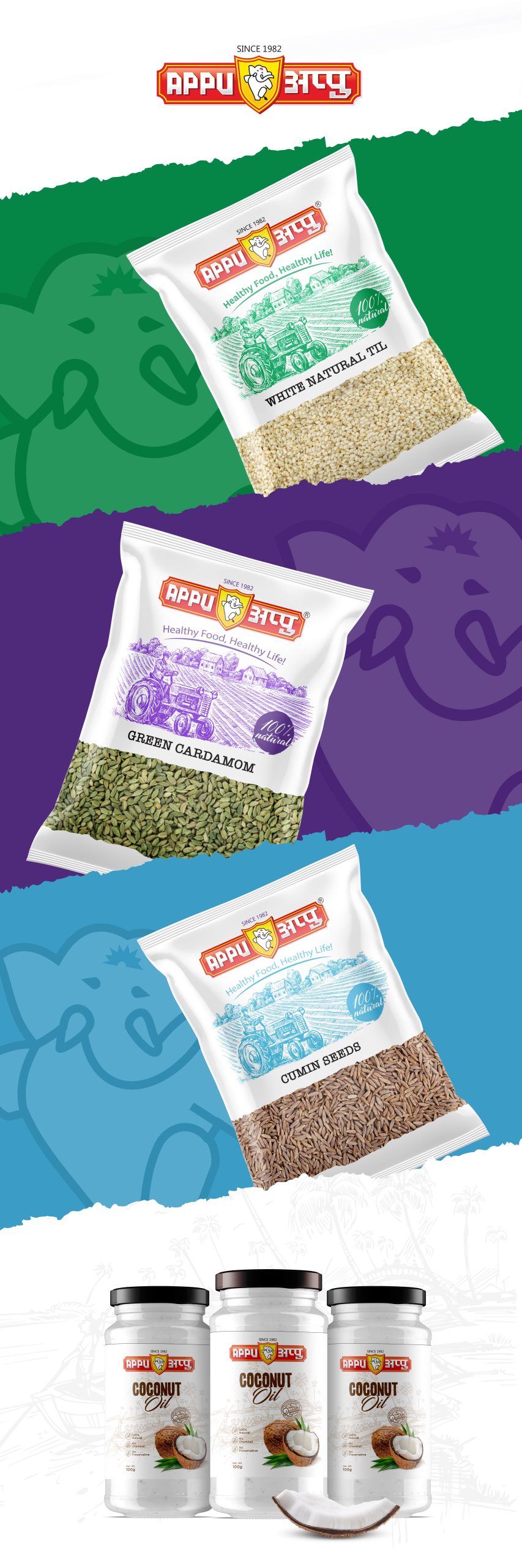

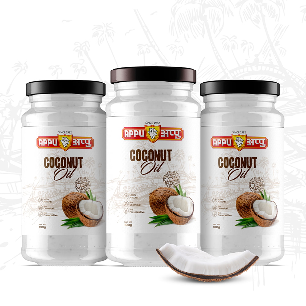
The development of the packaging design for Appu oils company involved a deliberate and strategic process, resulting in a sober design that effectively appealed to the target audience. The primary goal was to create visually impactful packaging that conveyed a sense of sophistication and reliability.
To achieve this, careful consideration was given to the use of suitable typography. Attention-grabbing fonts were thoughtfully selected to highlight key elements such as the brand name, product descriptions, and essential information. With typography, products are able of capturing the attention of the target audience and conveying a sense of professionalism and trustworthiness.
Moreover, the design aimed to be sober and refined. Colours were chosen deliberately to reflect a sense of elegance and authenticity. Subtle and sophisticated hues were utilized strategically, enhancing the overall visual appeal of the packaging and resonating with the target audience.
Throughout the design process, numerous iterations and refinements were made to ensure that every aspect of the packaging design aligned with the desired objectives.
The final outcome was a sober packaging design that effectively appealed to the target audience of the oil company. Through the use of bold typography and refined colour s, the design successfully captured the attention of consumers, communicated the brand’s professionalism, and conveyed a sense of trustworthiness. It contributed to a positive brand perception and strengthened the company’s position in the competitive oil market.