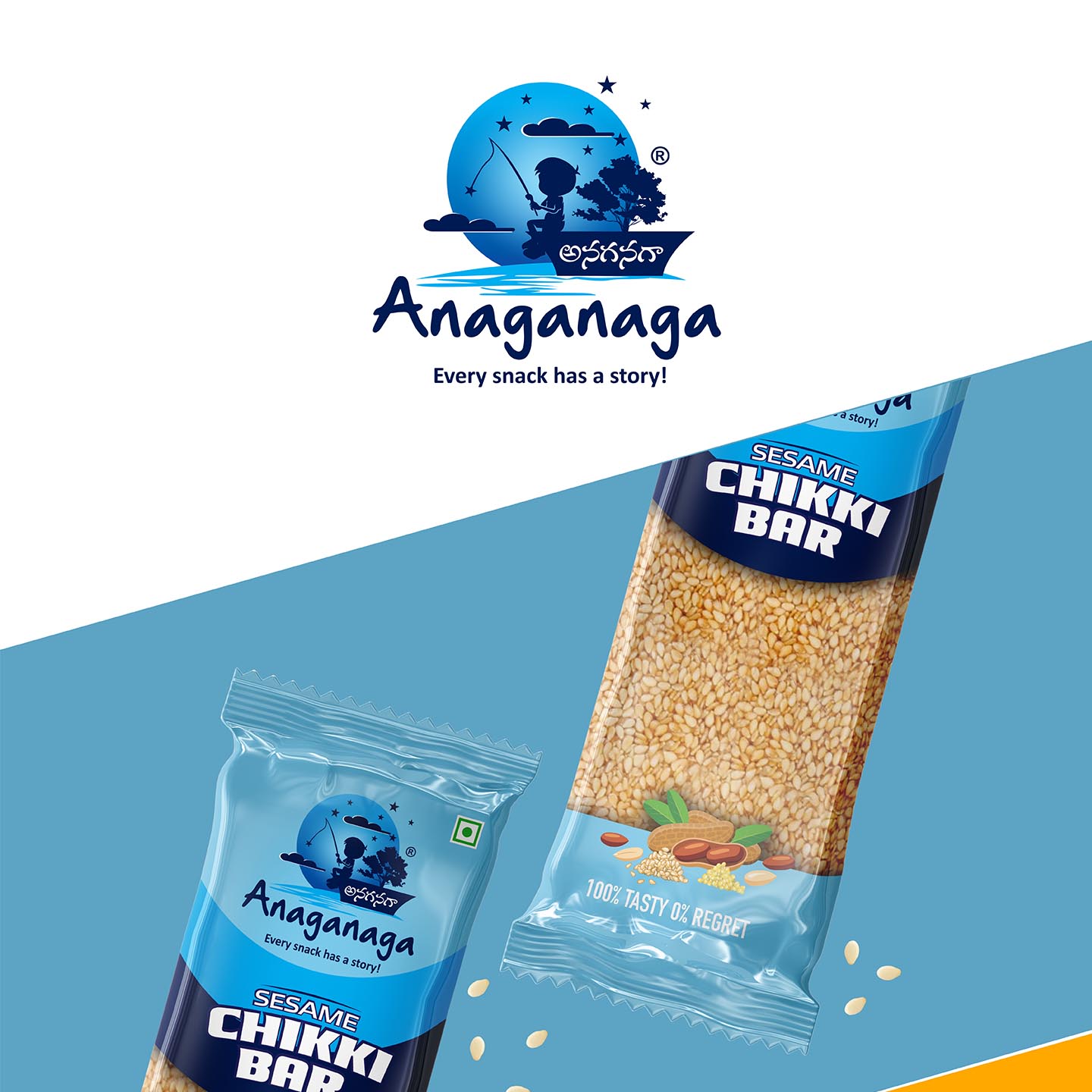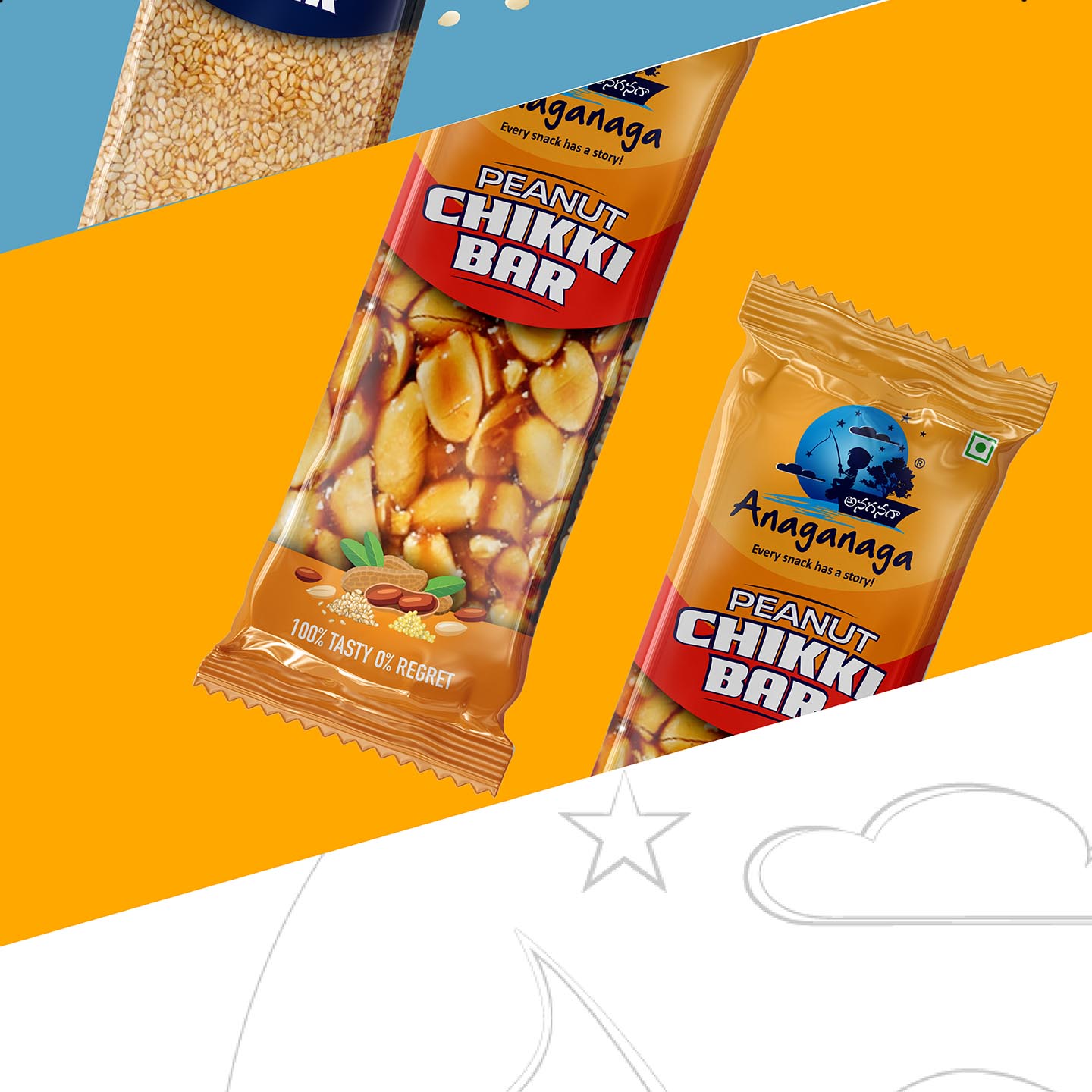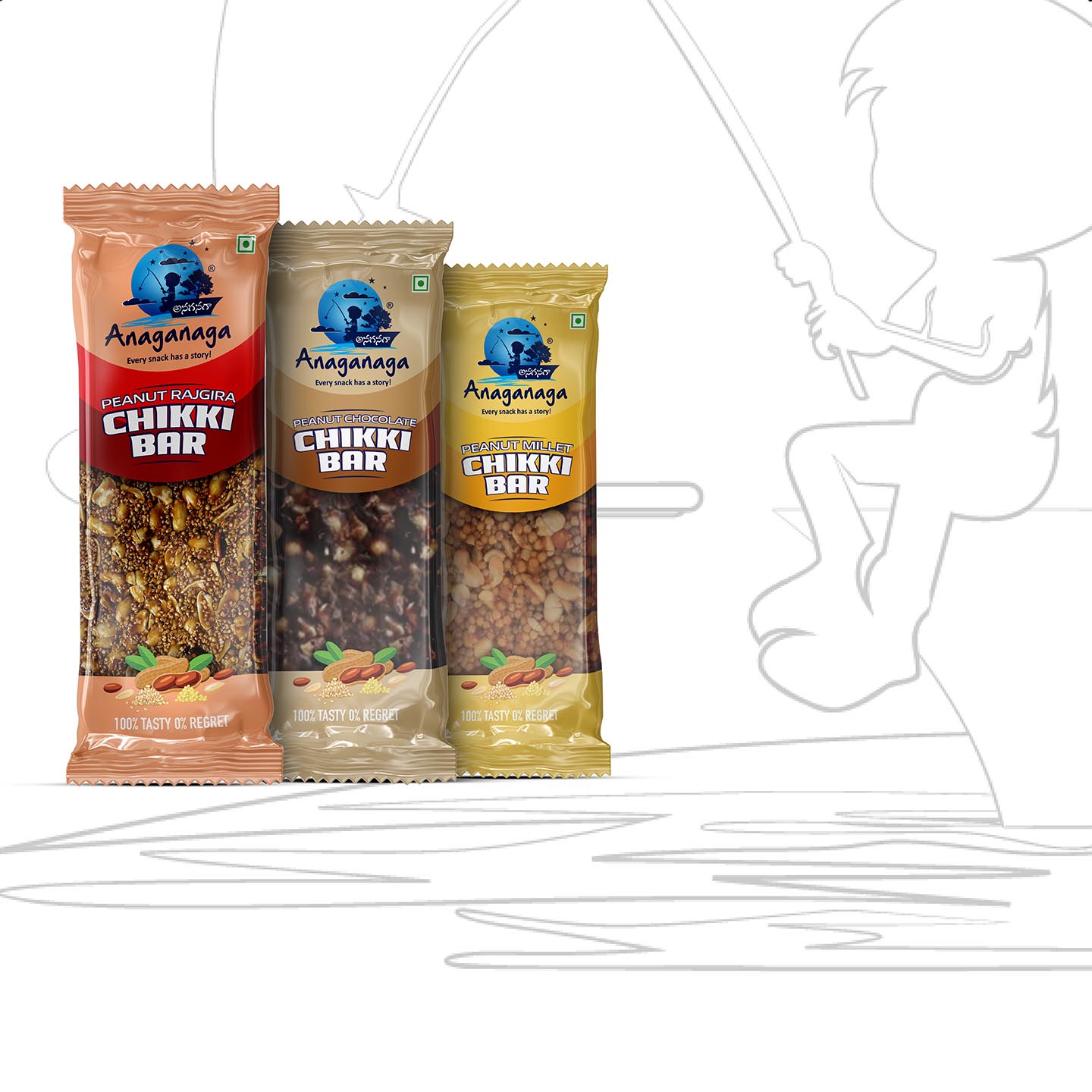

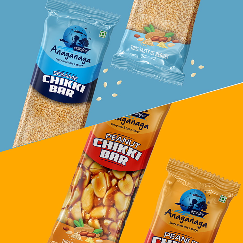
In Anangnaga’s packaging design, we have employed a vibrant colour scheme across various products to create a cohesive brand identity. By utilizing identical colour s, we enhance brand recognition and establish a visual connection between different offerings.
To make the packaging more engaging and informative, we have strategically highlighted the key ingredients of each product. This not only communicates the unique qualities of the items but also appeals to customers who seek specific ingredients in their choices.
Moreover, we have incorporated a window feature in the packaging design. This window serves as a showcase, providing a glimpse of the actual products inside. By offering a visual preview, we create a sense of transparency and build trust with customers, allowing them to assess the product’s quality and freshness even before making a purchase.
By combining consistent colour s, ingredient highlights, and a window showcase, our packaging design aims to create a visually appealing and informative experience for customers. We strive to foster a strong brand identity, engendering loyalty and trust among tea enthusiasts.