
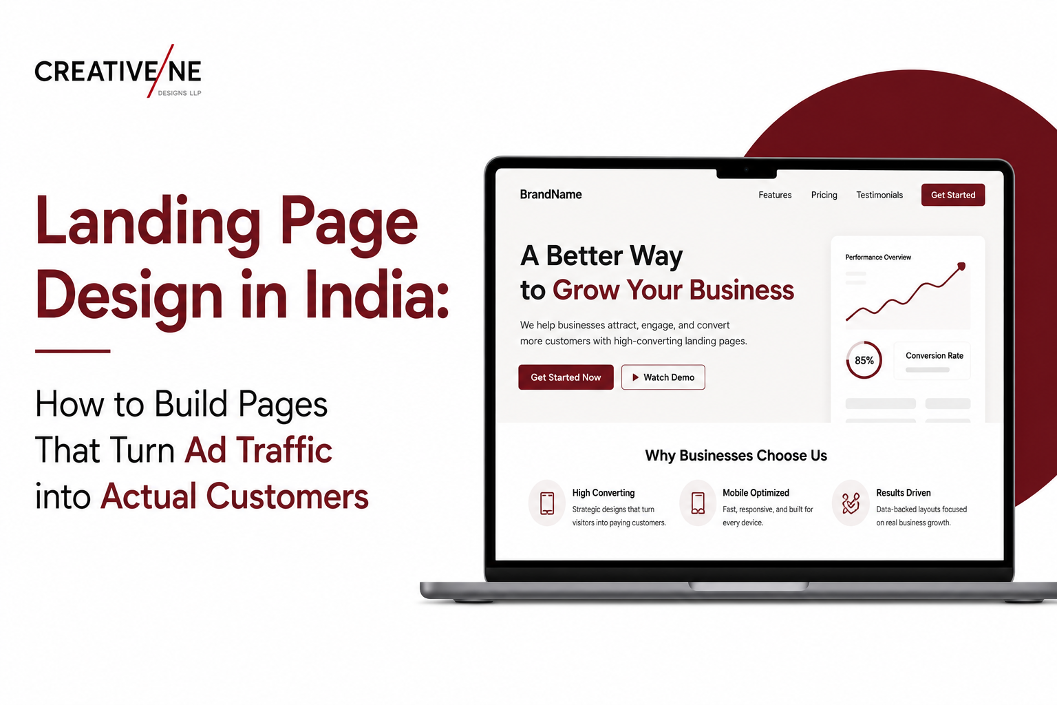
Indian businesses spent over Rs. 35,000 crore on digital advertising in 2024. Most of that traffic lands on generic website pages – homepages, product category pages, contact pages – not built to convert a specific offer for a specific audience. The average landing page conversion rate for Indian digital campaigns across industries is 2 to 4 percent. Purpose-built pages with professional web UI/UX design consistently convert at 6 to 15 percent for the same traffic. The gap is not product quality, offer strength, or advertising budget – it is design.
What Is a Landing Page and How Is It Different from a Website Page?
A landing page is a standalone web page designed around a single conversion objective – a form submission, phone call, purchase, or download. What makes it different from a regular website page is what it does not have: no main navigation, no links to other sections of the website, no competing CTAs, no distraction from the single objective.
Removing the navigation menu – something that feels counterintuitive to most business owners – consistently increases conversion by 5 to 15 percent. Every link a visitor can click to leave the landing page is a conversion leak. A landing page by definition has no leaks: the visitor either converts or leaves.
The Anatomy of a High-Converting Landing Page
The Hero Section – 5 Seconds to Keep the Visitor
The hero section – what is visible without scrolling – determines whether 60 to 70 percent of visitors continue or immediately leave. It must contain: a headline stating the offer in plain, specific language (not a tagline); a subheadline providing the key reason to act; a hero image or short video showing the product, service, or outcome; and a primary CTA button with action-oriented copy (‘Get a Free Quote’, ‘Book a Consultation’, ‘Start Free Trial’) – not passive copy (‘Learn More’, ‘Click Here’).
The Social Proof Section – Build Trust Before the Ask
Indian customers, particularly in B2B and health categories, require trust establishment before submitting a form or calling an unfamiliar business. Social proof placed immediately below the hero should include: customer count or years in business, recognisable client logos, average star rating with review count, one to three short testimonials, and media mentions or certifications. This section does the trust work that enables the conversion.
The Offer and Features Section – Why This and Why Now
Benefits should be written in visitor-centric language – ‘You get X’ not ‘We provide X’. Three to five key benefits as scannable bullet points outperform a paragraph of copy. Avoid listing more than six benefits – at seven and above, visitors start discounting them rather than accumulating them.
The Form – Reduce Friction to Zero
Ask for the minimum information required to initiate the next step. For a lead generation page, name and phone number or email is sufficient in most Indian B2B contexts. Adding company name, budget range, or industry adds friction that reduces completions without meaningfully improving lead quality at the top of the funnel.
The Footer CTA – For Scrollers Who Reached the Bottom
Visitors who scroll to the bottom are high-intent. Replace the standard website footer with a second CTA – a brief offer summary and a second instance of the primary CTA button. This recovers 10 to 20 percent of visitors who did not convert at the hero section.
Landing Page Design by Campaign Type
Lead Generation Pages
The most common type for Indian service businesses. The conversion action is a form submission. Design priority: trust signals above the form, field count minimised (maximum three to four), CTA copy specific to the offer (not ‘Submit’). For services where value is not immediately obvious, a brief explanation of what happens after form submission reduces abandonment.
Product Sales Pages
Used by D2C and e-commerce brands for specific product launches or promotional campaigns. These pages combine product photography, benefits copy, pricing with offer, reviews, and direct checkout. UPI, Net Banking, COD, and EMI options should be visible on the sales page before the checkout step – price sensitivity is high in Indian D2C and payment flexibility visibility early in the page increases conversion.
Event Registration Pages
Webinar and workshop registration pages follow the same single-objective logic. Event date, time, and format (online or in-person, free or paid) must be prominent in the hero. Social proof is speaker credentials and past attendee count. The registration form should ask only for name and email for free events.
Visual Design Rules Specific to Landing Pages
The broader principles of conversion rate design apply at higher intensity on landing pages, where every element either supports or undermines a single outcome. CTA button colour must contrast sharply with the page background – this is a conversion mechanism, not an aesthetic choice. White space around the CTA button increases conversion by making the action visually isolated. Button size on mobile must accommodate thumb-tap accuracy – minimum 44×44 pixels tap target.
Mobile-First Landing Page Design for India
Over 80 percent of digital advertising clicks in India are on mobile devices. Landing page design must start from the mobile layout – 375 to 430 pixel viewport width – not adapt from desktop. Mobile requirements: single-column layout, minimum 16-point body type, CTA button spanning the full content width, forms with large tap targets and autofill-enabled fields, and page weight under 500 KB for 2-second load time on 4G.
Measuring and Improving Landing Page Performance
Landing page conversion is directly affected by load speed. A page taking more than 3 seconds to load on mobile loses over 50 percent of visitors before the headline is visible. The design and development decisions that determine website performance design outcomes – image format, render-blocking scripts, Core Web Vitals – apply with particular intensity to landing pages where every visitor represents paid advertising spend.
For benchmark conversion rates by industry and the design variables that consistently lift performance in A/B tests, Unbounce’s Conversion Benchmark Report provides annual data across categories including SaaS, agencies, e-commerce, and professional services – useful reference for setting realistic targets and identifying where current performance sits relative to industry averages.
Build a Landing Page That Converts Your Ad Traffic – with Creativeline
Creativeline designs high-converting landing pages for Indian businesses running Google, Meta, and performance campaigns – single-objective layouts, mobile-first design, A/B-test-ready structure, and sub-2-second load time built in
FAQs
Q1. What is a landing page and why do I need one for my ads in India?
A: A landing page is a standalone web page designed for a single conversion objective – a form submission, purchase, or phone call. Sending paid traffic to a landing page instead of a homepage typically doubles or triples conversion rate for the same ad spend, because every design decision serves one objective with no distractions.
Q2. How much does landing page design cost in India?
A: A single landing page design costs between Rs. 8,000 and Rs. 30,000 depending on complexity, custom illustration, and whether development is included. Full-funnel systems with multiple pages (main page, thank you page, upsell page) cost Rs. 25,000 to Rs. 75,000.
Q3. How long does it take to design a landing page in India?
A: A single landing page design typically takes 5 to 8 working days. Development on Webflow, WordPress, or HTML adds 3 to 5 more days. A complete project from brief to live publication typically runs 10 to 15 working days.
Q4. What should a landing page include to improve conversion?
A: A headline stating the specific offer, social proof above the primary CTA, three to five key benefits as bullet points, a form with minimal fields or direct purchase CTA, trust signals near the conversion point, and a repeated CTA at the bottom. No navigation menu, no external links, no competing CTAs.
Q5. Should a landing page have navigation links?
A: No. Removing the navigation menu is a standard conversion optimisation practice that increases conversion by 5 to 15 percent. Every link that can take a visitor off the page is a conversion leak. The only links should be the CTA button and required legal links (privacy policy, terms) in a minimal footer.
Q6. What is a good conversion rate for a landing page in India?
A: Lead generation pages in B2B services typically convert at 3 to 8 percent. E-commerce product pages convert at 1 to 4 percent. Free event registration pages can reach 20 to 35 percent. Well-optimised pages consistently perform 2 to 3 times the category average – the gap between well-designed and poorly designed is almost always larger than the gap between good and bad ad targeting.
Q7. What is the difference between a landing page and a website home page?
A: A home page serves multiple audiences with multiple objectives – it introduces the company, shows the range of services, provides navigation, and addresses multiple customer types. A landing page serves one audience segment with one objective. Home pages are discovery and credibility tools. Landing pages are conversion tools. Using a home page as a landing page for paid advertising is the most common cause of wasted digital ad spend.
