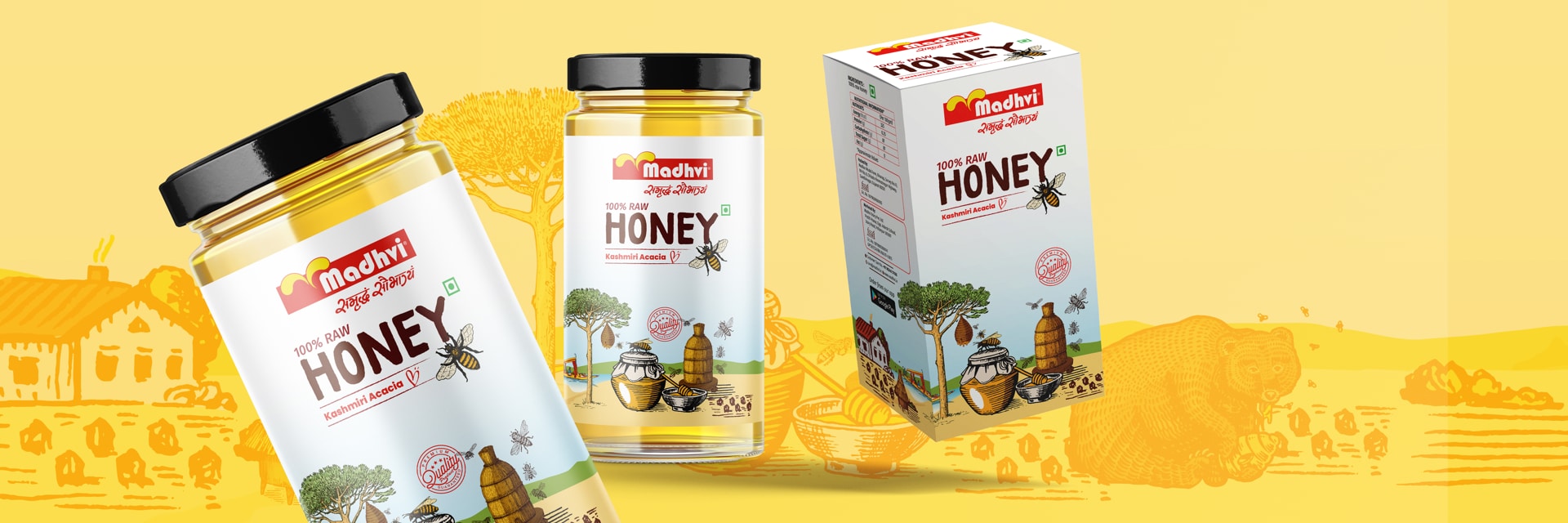

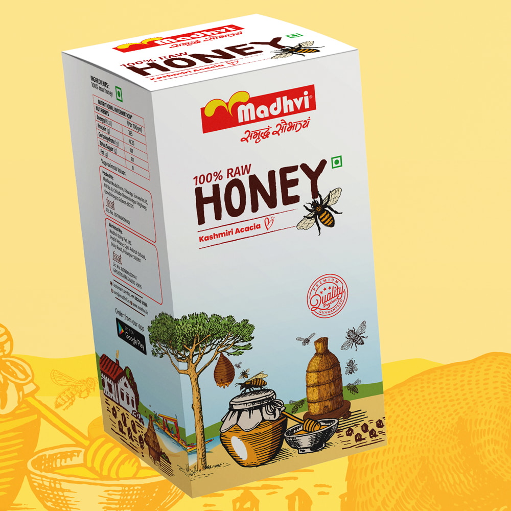
The development of a visually soothing packaging design for Madhvi’s pure honey entailed a comprehensive and meticulous process. The design team undertook extensive research to gain a profound understanding of the brand’s core values and target market. Our objective was to craft a design that not only highlighted the traditional honey-making process but also captivated consumers through captivating colour s and elegant typography.
Drawing inspiration from the rich heritage of honey making, the goal was to create a design that would resonate with consumers, instilling a sense of trust and authenticity.
Colour selection played a prominent role in achieving the desired eye-soothing effect. The team meticulously chose colour s that were visually appealing, soothing, and aligned with the natural essence of honey. We aimed to create a harmonious colour palette that would evoke feelings of warmth and purity.
Typography was another crucial aspect of the design process. We selected fonts that were elegant, legible, and reflective of the brand’s values. We paid great attention to the placement and hierarchy of text, ensuring that essential information such as the product’s origin, nutritional details, and branding elements were prominently displayed and easily readable for consumers.
Iterative design reviews and feedback sessions were conducted to refine and enhance the packaging design. We made adjustments to strike the perfect balance between showcasing the traditional honey-making process and incorporating eye-grabbing colour s. Our aim was to create a visual experience that would not only capture the attention of consumers but also convey the purity and high quality of Madhvi’s pure honey.
During the production phase, collaboration with manufacturers was vital. The team worked closely with experts to select suitable materials that maintained the integrity of the design while ensuring durability and protection for the product. We also considered eco-friendly options to align with Madhvi’s commitment to sustainability.
Quality control measures were implemented to maintain consistency and ensure that the final packaging met the highest standards. Thorough inspections were conducted to verify colour accuracy, print quality, and overall product presentation.
Our focus on showcasing the traditional honey-making process, incorporating eye-grabbing colour s, and employing fine typography resulted in visually appealing packaging that effectively conveyed the brand’s values and the pureness of the honey. The careful selection of colour s and fonts, along with the presentation of the traditional honey-making process, created a packaging design that captivated consumers and stood out in the market.