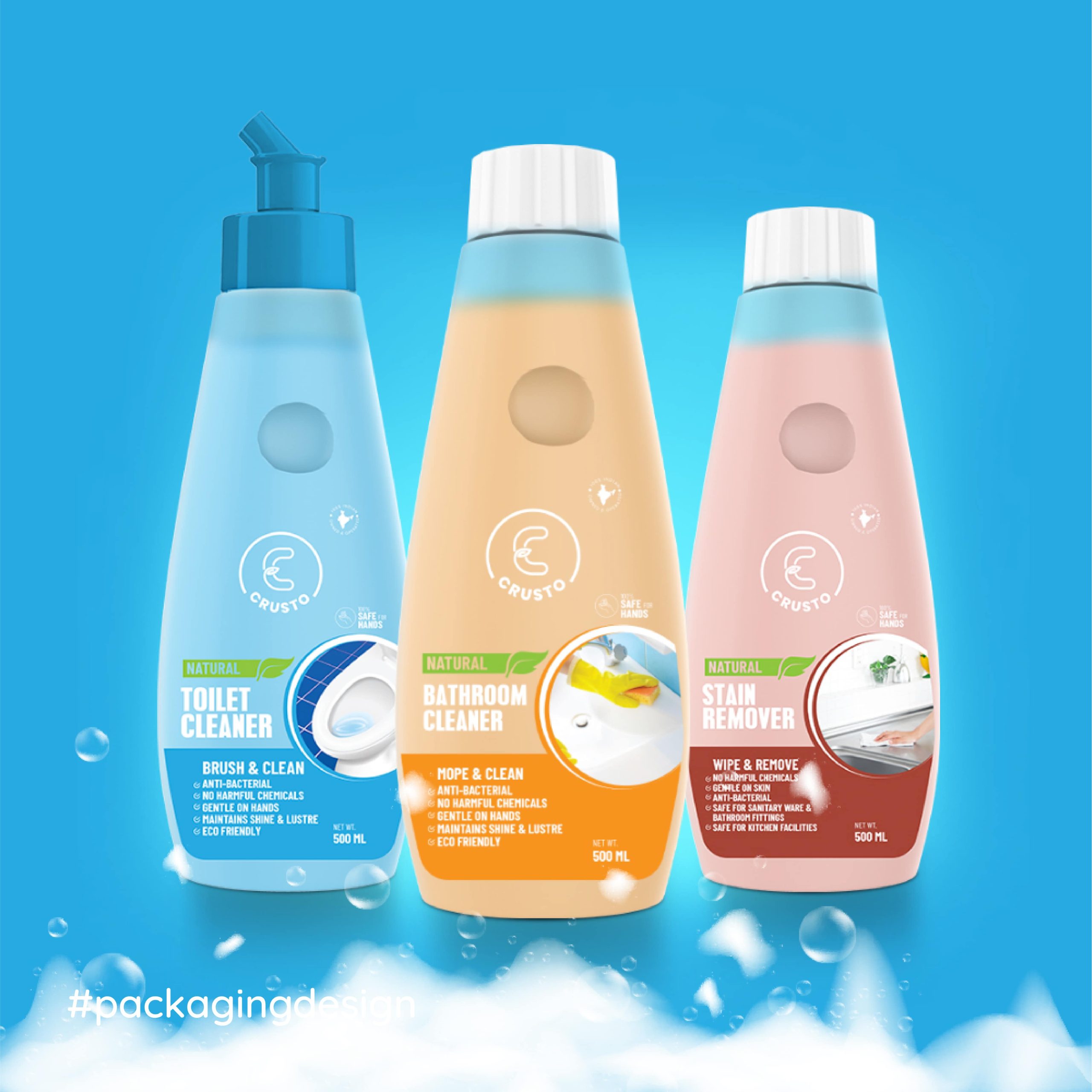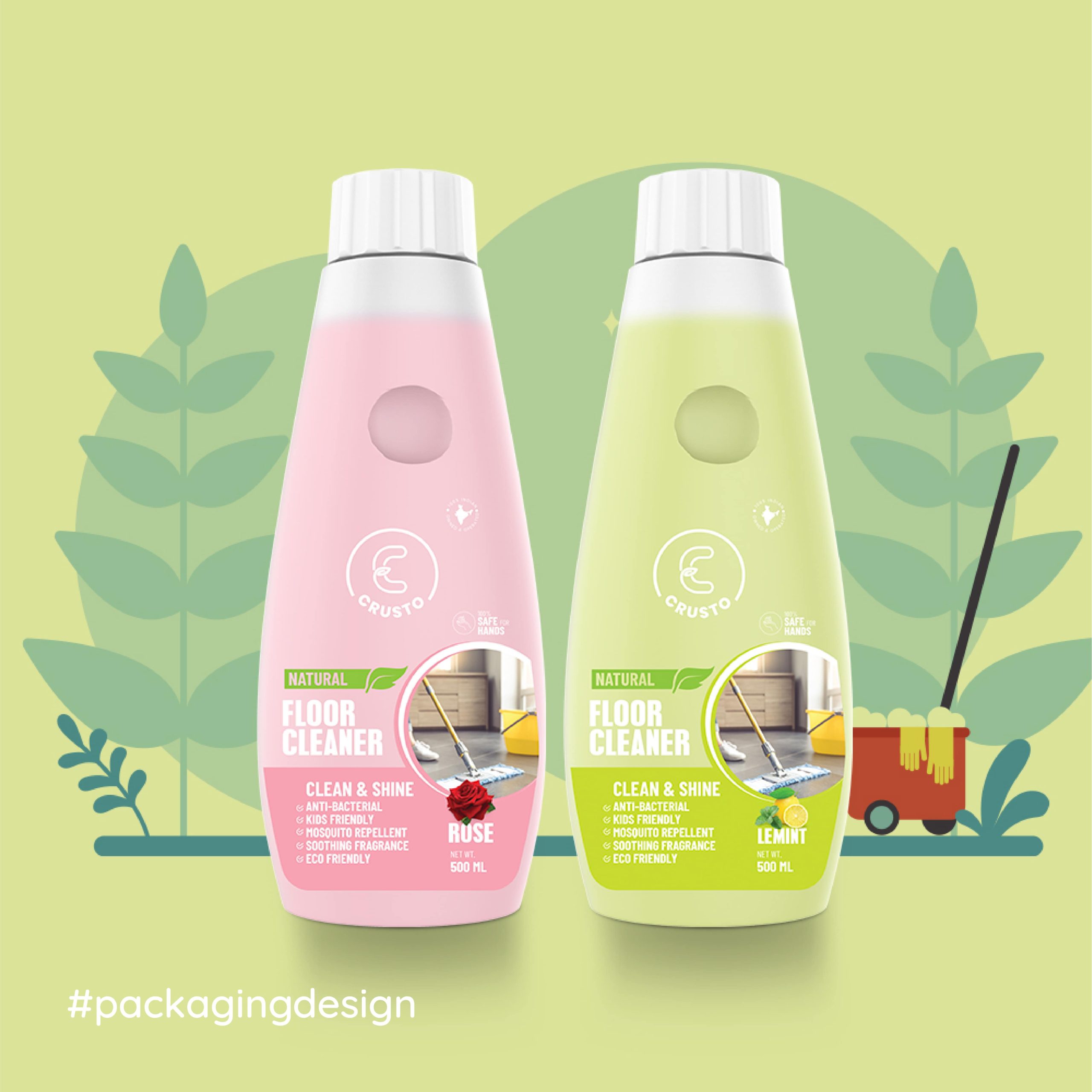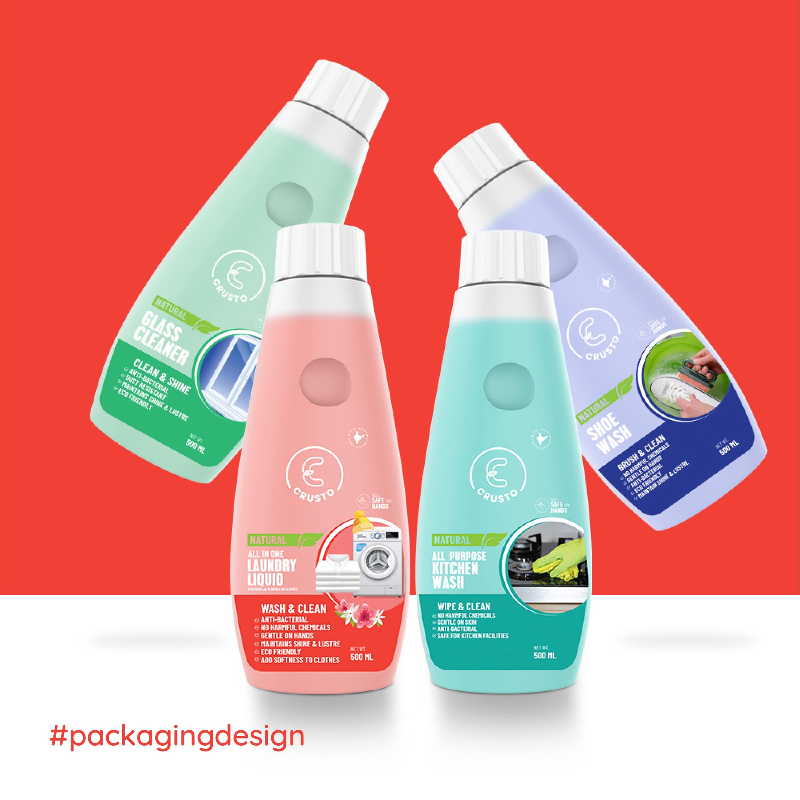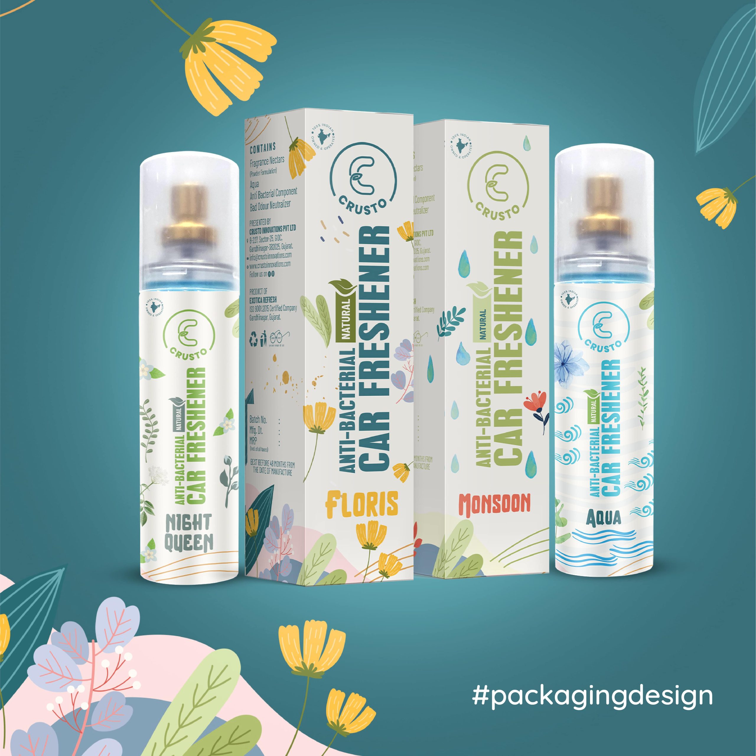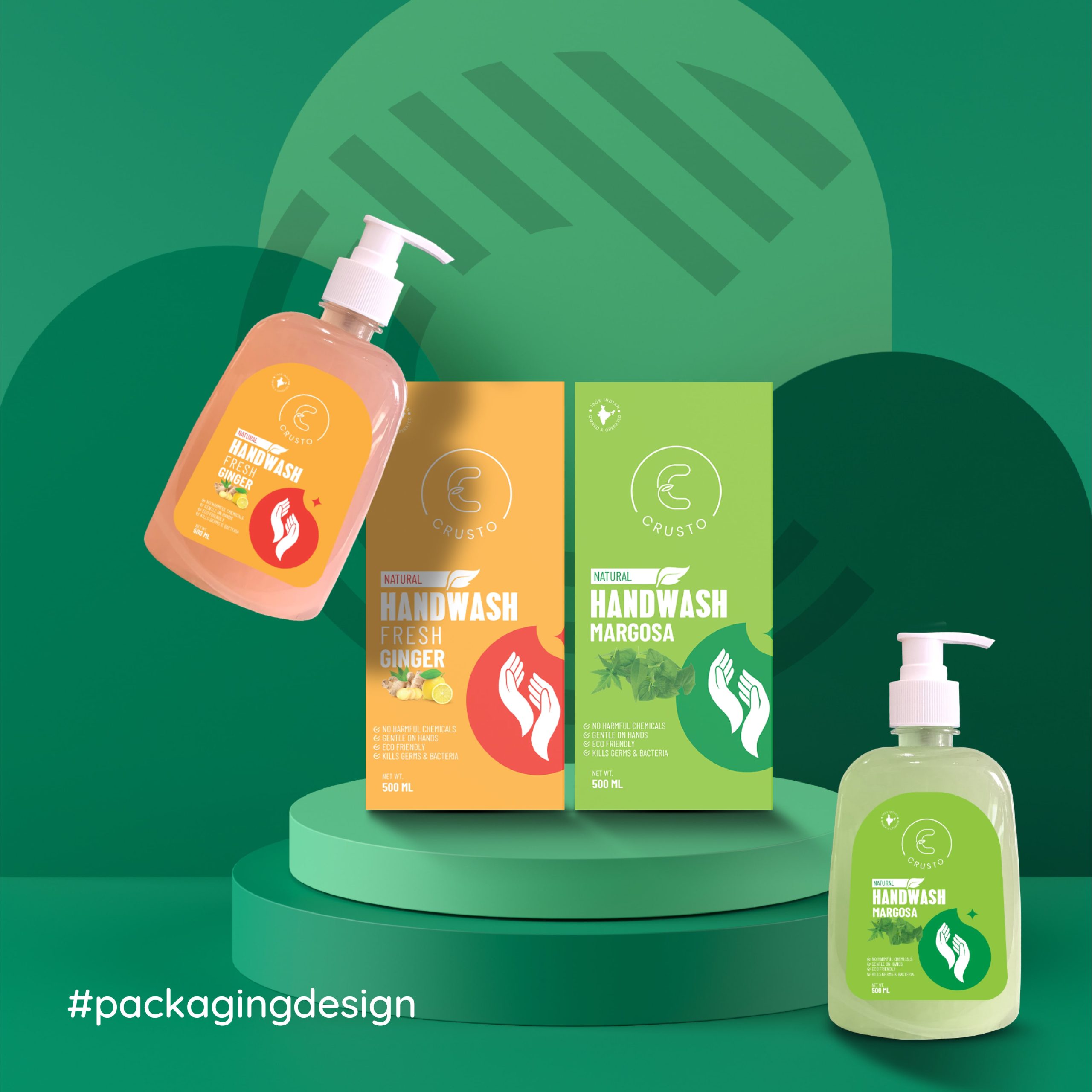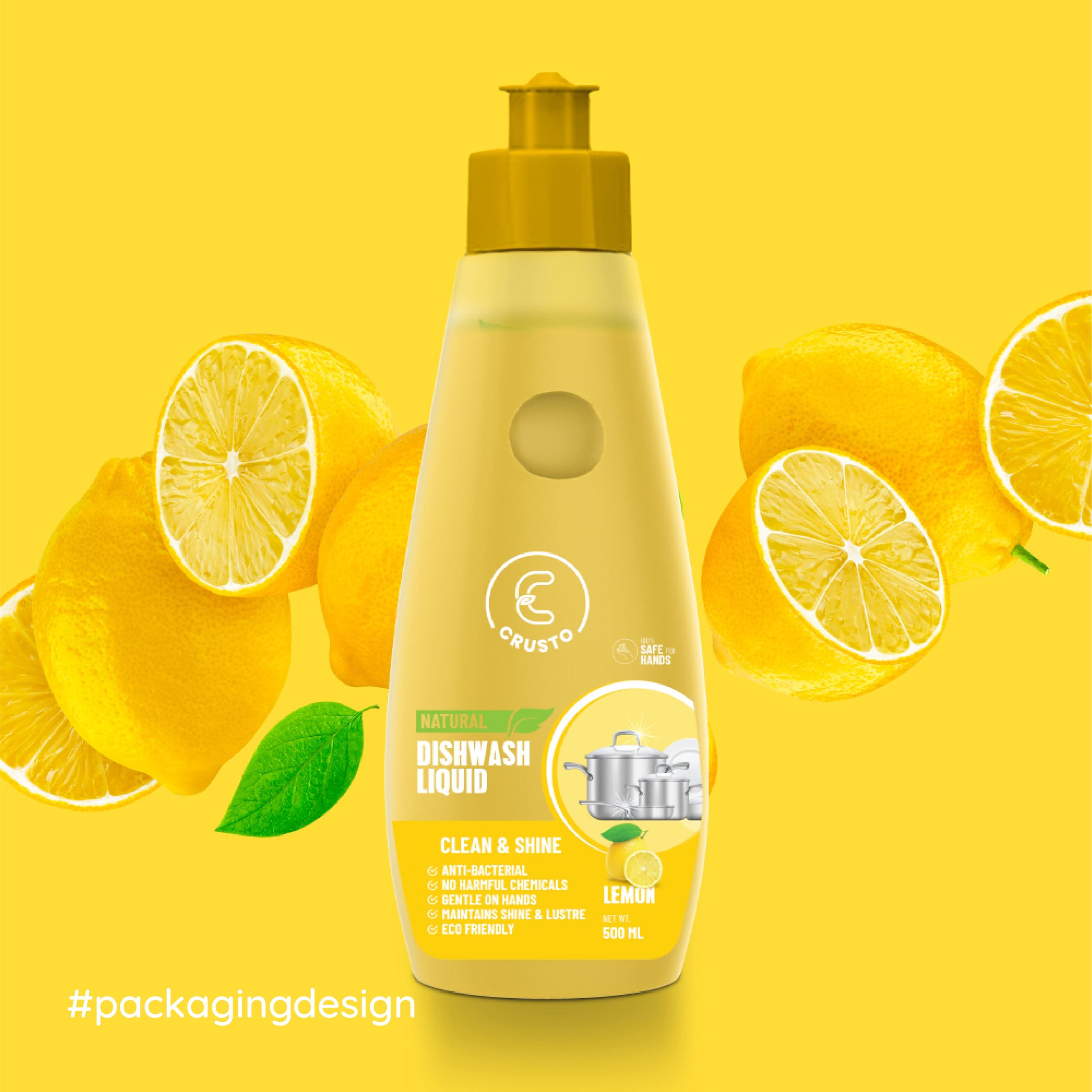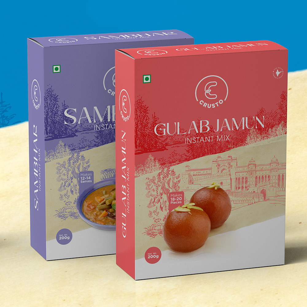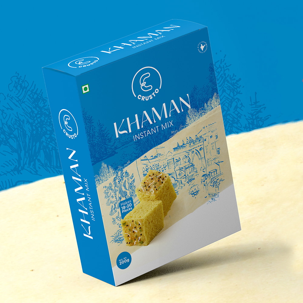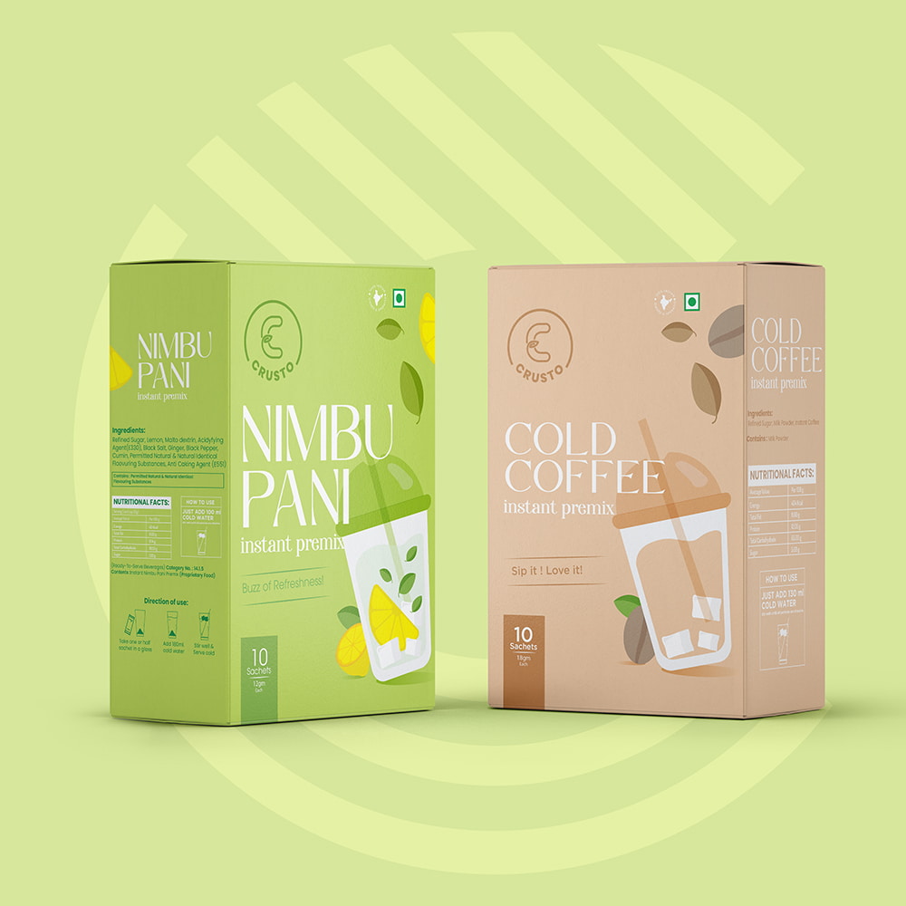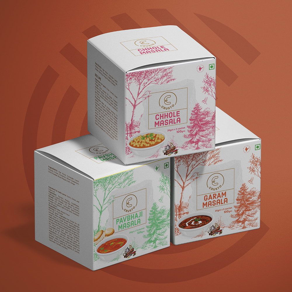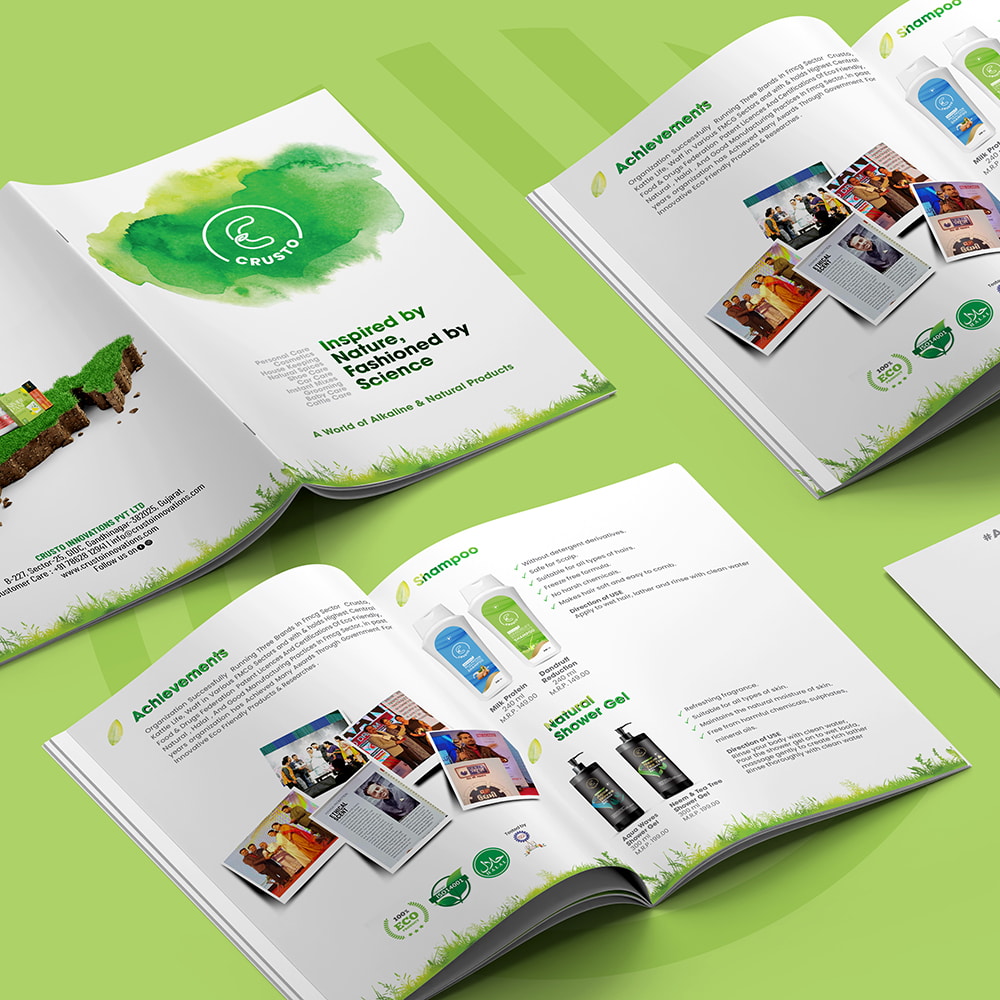

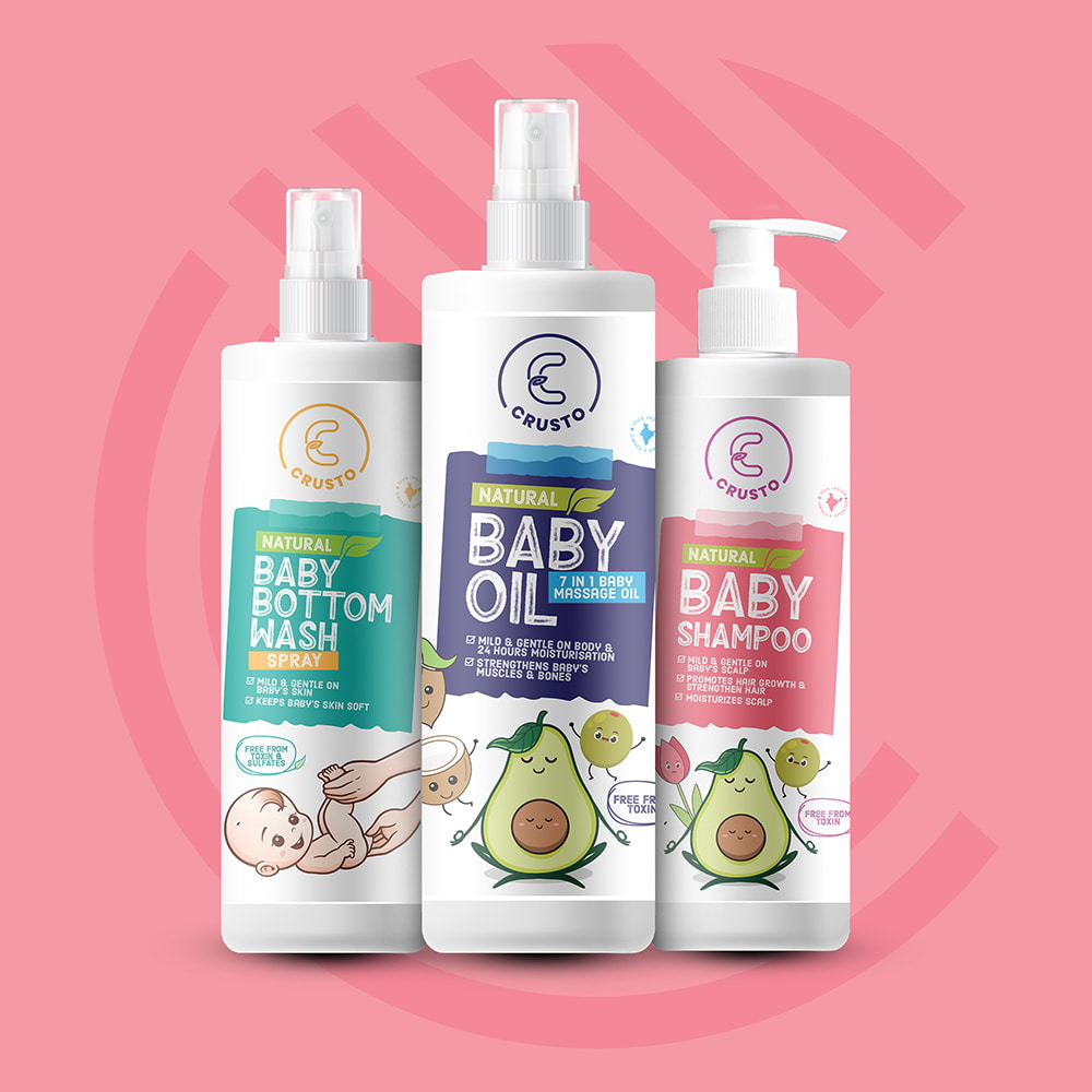
The rigorous and imaginative process involved in the development of the packaging design for Crusto Innovations aimed to create a refined and pristine design that effectively presented the products and communicated the brand’s dedication to using natural ingredients. To accomplish this, great attention was devoted to incorporating the product ingredients as a central element in the design.
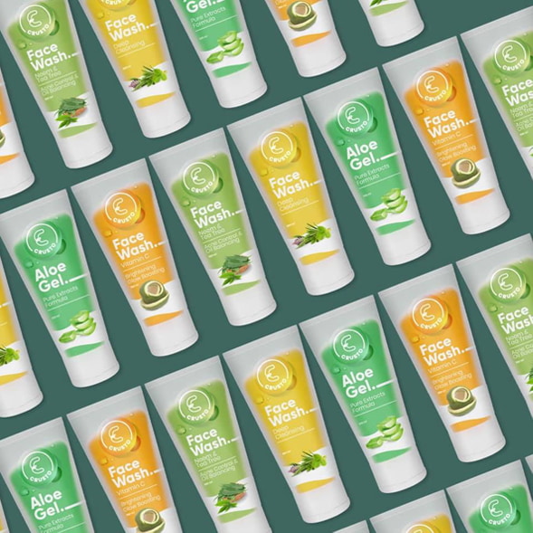
Actual product ingredients were thoughtfully incorporated into the packaging design, serving as a visual representation of the natural and wholesome nature of the products. These ingredients were selected based on their relevance and appeal, showcasing the purity and effectiveness of the company’s offerings. This integration into the design created a connection with consumers, reassuring them of the brand’s commitment to quality and transparency.
In addition to the product ingredients, bold typography played a crucial role in the design. Attention-grabbing fonts were chosen to highlight the brand name, product descriptions, and key features of Crusto Innovations. The typography served as a visual anchor, conveying a sense of professionalism and trustworthiness. It effectively communicated the brand’s values and resonated with the target audience, encouraging them to explore the benefits of the products further.
Throughout the design process, numerous iterations and revisions were undertaken to ensure that every aspect of the packaging design met the desired objectives. Valuable feedback from consumers and extensive market research played a vital role in refining the design, ensuring its alignment with the preferences and expectations of the target market.