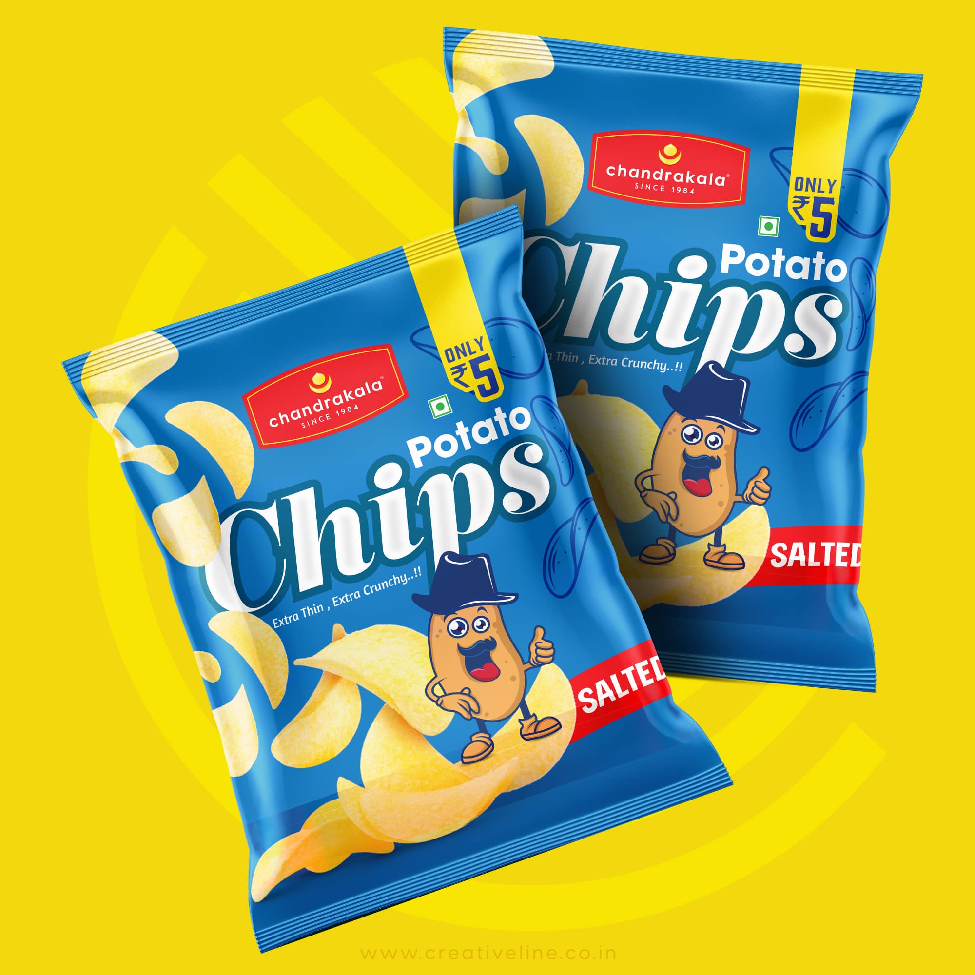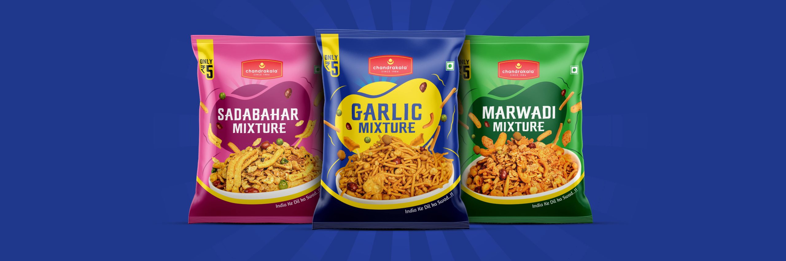

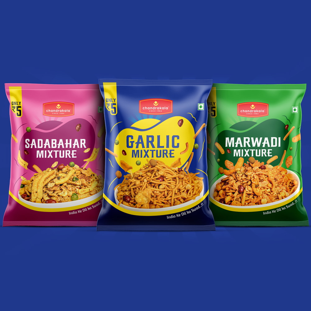
In Chandralekha’s packaging design, we have carefully chosen eye-catching colour s that instantly grab the attention of customers. Each product in our line-up features a unique colour scheme that not only adds vibrancy and visual appeal but also helps differentiate the offerings from one another.
To further enhance the customer’s experience, we have strategically highlighted the key ingredients of each product. By prominently featuring these ingredients on the packaging, we aim to provide valuable information and create a strong connection between the product and the customer’s preferences. This approach not only helps customers quickly identify the flavour they desire but also communicates the quality and essence of offerings.
Additionally, we have gone the extra mile by incorporating real images of the actual products within the packaging design. By showcasing these authentic visuals, we provide customers with a tangible and realistic representation of what they can expect inside. This transparent approach instils confidence in the product and strengthens the trust customers place in the brand.
Through the use of eye-catching colours, ingredient highlights, and real product images, packaging design aims to deliver a visually captivating and informative experience. By effectively engaging customers with these elements, we seek to build a strong brand identity and foster a loyal following for our exceptional tea products.