
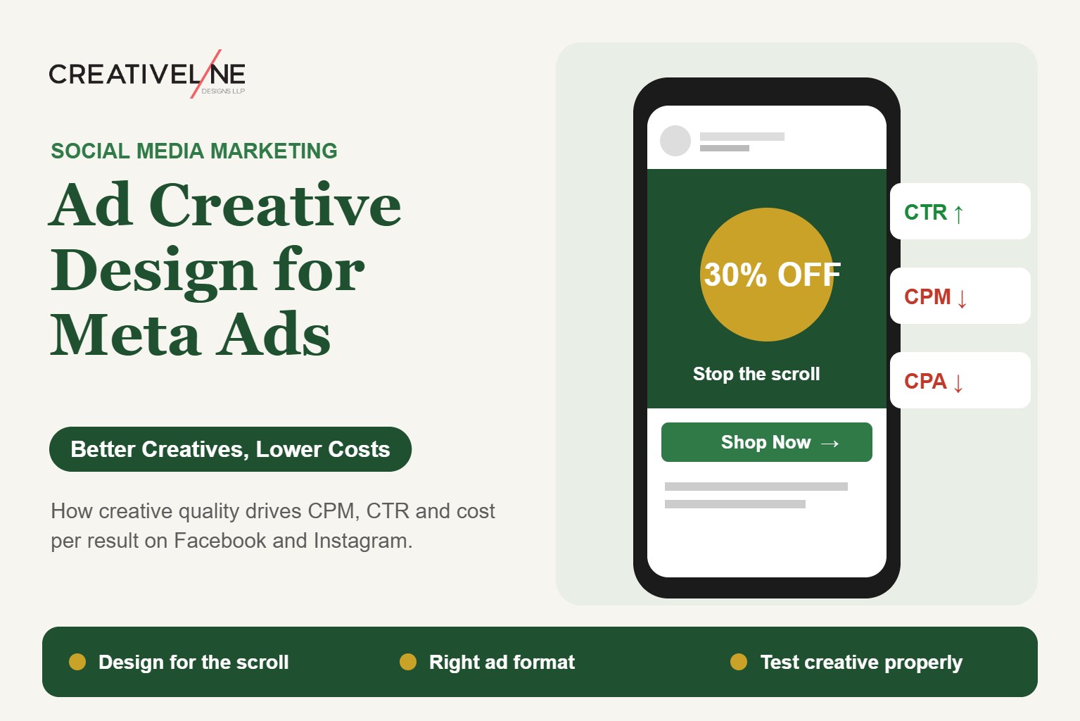
Ask most brands why a campaign underperformed, and the first instinct is to blame targeting. Wrong audience. Wrong budget split. Wrong platform. Rarely does anyone open the ad itself and ask if the ad creative was the real problem.
It usually is. Meta’s ad system rewards ads that hold attention and get engagement. So creative quality doesn’t just change how an ad looks. It directly changes what you pay to show it. Two identical budgets, same audience, same goal, can produce very different costs per result, purely because one ad’s creative was built to perform and the other wasn’t.
Table of Contents
- How ad creative quality affects CPM and CTR
- Static vs. carousel vs. video: when each works
- Common design mistakes that waste ad budget
- Designing for the scroll, not the screen
- Testing creative properly
- FAQs
How Ad Creative Quality Affects CPM and CTR
Meta’s ad auction isn’t pure pay-to-play. It factors in estimated action rate and overall ad quality alongside your bid. An ad people engage with, or at least don’t hide or report, costs less to run than a weak ad targeting the exact same audience. The platform is optimising for user experience, not just advertiser spend.
This shows up in two connected ways.
CTR (click-through rate) improves with creative that earns attention fast. A strong first half-second of a scroll signals relevance to the algorithm. That tends to lower CPM (cost per thousand impressions) over the life of the campaign, since the platform doesn’t need to work as hard to find engagement.
Weak creative wears out faster. Strong ads can run to the same audience for longer before performance drops, since people don’t tune them out quickly. Weak ads often decay within days, forcing constant refreshes, which pushes costs up as the algorithm keeps searching for engagement that isn’t there.
The takeaway: creative isn’t a separate cost from media spend. It’s a lever that directly changes how well that spend performs.
Static vs. Carousel vs. Video: When Each Works
There’s no single best format. The right choice depends on what the ad needs to say, and where in the funnel it sits.
Static images work well for simple, clear offers. One product, one clear price, one straightforward benefit. They’re fast to make and test in volume, useful for early audience and message testing before you invest in pricier formats.
Carousels suit product ranges, step-by-step explanations, or before-and-after comparisons. Anything that benefits from several frames a user can swipe through at their own pace. They also work well for catalogue-style FMCG or fashion brands showing several products in one ad.
Video usually wins for showing how something works, building emotional connection, or explaining a more complex offer that one static frame can’t carry. But it has to earn attention in its first one to three seconds, since most viewers decide whether to keep watching almost right away. Video also autoplays muted by default, so the visual, not the audio, has to do the early work.
A simple rule: use static and carousel for early testing and simple, price-led offers. Save video budget for retargeting, or for messages that genuinely need motion to land.
Common Design Mistakes That Waste Ad Budget
Designing for a large desktop screen, then shrinking it down. Most impressions on Facebook and Instagram happen on mobile, in-feed, at a fraction of the size a designer might see on a monitor. Text, logos, and key details that read fine on a large screen can turn illegible at mobile feed size.
Too much text on the creative. Dense, text-heavy images underperform. Not because of a hard platform penalty, that old 20% text rule is gone, but because cluttered creative reads as an ad right away and gets scrolled past faster than clean, visual-led creative.
Ignoring safe zones for different placements. The same creative often runs across Feed, Stories, and Reels, each with a different shape and UI overlay, like profile pictures or caption text, that can cover key parts of the image if nobody planned for it.
No single clear focal point. Ads trying to say three things at once, a discount, a product range, and a brand tagline, usually say none of them well. The strongest creative tends to lead with one clear idea per ad.
Reusing organic content as-is. Content that performs well organically doesn’t always perform well as paid creative. Organic posts reach people who already follow the brand. Ad creative has to work on cold audiences seeing the brand for the first time, and often needs more context to land.
A weak or buried call-to-action. A CTA that’s implied rather than stated, or small compared to everything else in the ad, leaves performance on the table. The ad should make it obvious what happens when someone taps.
Designing for the Scroll, Not the Screen
The biggest mindset shift between good and average ad creative is this. An Instagram or Facebook feed ad isn’t being looked at. It’s being scrolled past. The job of the first frame, or the first second for video, is to stop that scroll.
That changes what “good design” means here.
- High contrast and bold, simple layouts tend to beat subtle, elegant designs that would work well on a website or in print. The ad has a fraction of a second to register before a thumb keeps moving.
- Faces and real people generally earn more attention in-feed than product-only shots, especially for categories where trust or emotion matters, like skincare, food, or services.
- Native-feeling creative, content that looks like it belongs in the feed rather than a polished ad unit, often beats highly produced creative for reaching cold audiences, even if it looks “less premium” to the brand team reviewing it internally.
Testing Creative Properly
Most wasted ad budget doesn’t come from bad creative running forever. It comes from testing so loose that nobody can tell what’s actually working. A few practical rules.
Test one variable at a time, where you can. Same audience and budget, different creative angle or format, so any change in performance can be pinned on the creative itself.
Give creative enough budget and time to exit the learning phase before judging it. Pulling an ad after a few hours of noisy early data isn’t a fair read.
Track cost per result, not just CTR. A high-CTR ad that draws clicks from people unlikely to buy isn’t the win it looks like on the surface.
Refresh creative before fatigue sets in, not after performance has clearly dropped. Frequency and CPM trends in Ads Manager are usually the earliest warning sign.
Planning your next ad push? Get Ad Creative That Performs, from Creativeline. We design for the scroll, not just the brief.
For the broader strategy layer, see our guides on organic vs. paid social media budgeting and Instagram marketing for Indian businesses.
FAQs
Does ad creative quality actually affect what I pay per click? Yes, indirectly. Meta’s ad auction factors in expected engagement alongside your bid, so stronger, more engaging creative tends to lower CPM and cost per result over a campaign’s life, compared to weaker creative aimed at the same audience.
Is video always better than static images for Facebook and Instagram ads? No. Video tends to work best for demonstration or emotional storytelling. Static and carousel formats often perform just as well, or better, for simple, clear offers and fast creative testing.
How much text is too much on a static ad image? There’s no hard platform limit anymore. But dense, text-heavy creative tends to underperform clean, visual-led creative, since it reads as an obvious ad and gets scrolled past faster.
Can I reuse my organic Instagram posts as paid ad creative? You can, but it often underperforms. Organic content reaches people who already follow the brand. Ad creative needs to work on cold audiences, who often need more context or a stronger hook.
How often should ad creative be refreshed to avoid fatigue? It varies by budget and audience size. Watch frequency and CPM trends in Ads Manager as early signals, rather than waiting until cost per result has clearly worsened.
What’s the single most common ad creative mistake you see? Designing for how the ad looks full-screen on a designer’s monitor, rather than how it actually appears in a mobile feed at a fraction of that size. Small text and fine detail get lost.
Should every ad have just one message, or can I promote several products in one ad? A single clear focal point generally works best for reaching cold audiences. Carousels are the better format for showing a range of products without diluting one ad’s message.
Written By Creative Line
