Most businesses start the logo conversation at the wrong place: colours and style. The more useful starting point is structure — because the types of logos available each behave differently on a shelf, an app icon, a hoarding, and a billing invoice. Pick the wrong type and you will fight it for years. This guide explains all nine types with familiar Indian examples, and gives you a simple way to decide which fits your business.
Why the Type of Logo Matters
A logo type is a structural decision, and structure determines what your logo can do. A detailed illustrated emblem may look magnificent on a menu card and turn into an unreadable smudge as a WhatsApp display picture. A pure wordmark works beautifully for a short brand name and becomes unusable when the name runs to four words.
Type also affects longevity. Businesses that choose a structure suited to how they will actually grow — more products, more channels, more markets — rarely need to rebrand for structural reasons. Businesses that choose on aesthetics alone often do, which is expensive in both money and lost recognition.
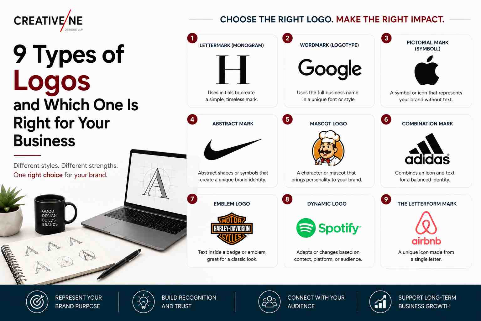
The 9 Types of Logos
1. Wordmark (Logotype)
The brand name itself, set in custom or carefully chosen typography. Think Zomato or FedEx. Works best when your name is short, distinctive, and worth building recognition around.
Caution: a long or generic name makes a weak wordmark. “Shree Krishna Industrial Suppliers” will not work as one.
2. Lettermark (Monogram)
Initials only — like IBM, HDFC, or LIC. Ideal when your registered name is long but the abbreviation is already how customers refer to you.
Caution: initials carry no meaning to a new audience. Lettermarks need marketing support to become recognisable.
3. Pictorial Mark (Brand Symbol)
A recognisable object or picture — the Apple apple, the Shell shell. Powerful, compact, and works at any size.
Caution: a symbol alone rarely works for a young brand. Most businesses need the symbol paired with their name for the first several years.
4. Abstract Mark
A geometric or non-representational form, like the Airtel swirl or the Pepsi globe. Excellent when you want to signal an idea (movement, connection, growth) without being tied to one product.
Caution: abstract marks require design skill and marketing investment to acquire meaning. Done cheaply, they look like clip art.
5. Mascot
An illustrated character representing the brand — the Amul girl, the Vodafone Zoo Zoos, the Air India Maharaja. Superb for approachability, food, children’s products, and campaign storytelling.
Caution: mascots date faster than other types and are harder to use in small digital formats.
6. Combination Mark
A symbol plus the brand name, usable together or separately — as with Paytm or Swiggy. This is the most practical choice for the majority of Indian businesses because it is flexible: full lockup on packaging, symbol alone as an app icon.
Caution: it requires a well-designed system, not just a picture placed beside text.
7. Emblem
Text enclosed within a shape — think Starbucks, most universities, or automotive badges. Conveys heritage, authority, and tradition.
Caution: emblems lose detail badly at small sizes, which makes them awkward for digital-first brands.
8. Dynamic Logo
A logo built as a flexible system — a consistent frame or structure with changing content (Google Doodles are the famous example). Suits media brands, events, and organisations with many sub-brands.
Caution: this needs proper brand guidelines and a design partner to maintain, so it is rarely right for a small business.
9. Responsive Logo
A logo designed in several progressive versions — full lockup, compact, symbol-only — so it adapts from a billboard to a favicon. Strictly speaking this is a system rather than a style, and in 2026 nearly every serious brand needs one.
Caution: it must be planned during design, not bolted on afterwards.
How to Choose the Right Type for Your Business
Work through these five questions honestly:
- How long is your brand name? Short and distinctive favours a wordmark; long favours a lettermark or combination mark.
- Where will the logo appear most? Packaging and signage tolerate detail; apps and social profiles demand simplicity.
- How old is your brand? New brands need their name visible — combination marks almost always beat symbol-only.
- What is your category? Food and children’s products suit mascots; professional services suit wordmarks and abstract marks; institutions suit emblems.
- What are your growth plans? Multiple products or sub-brands need a system, not a single fixed mark.
For most Indian SMEs launching or rebranding today, the answer lands on a combination mark delivered as a responsive set. It is flexible, it builds name recognition, and it survives every format you will encounter.
Can You Combine Types?
Yes — and most well-built brands do. A combination mark is by definition a hybrid, and the responsive approach means you will end up with several official versions of one identity: the full lockup, a horizontal variant, a stacked variant, and a symbol-only mark for tight spaces.
What matters is that these variants are designed deliberately as a family, documented in brand guidelines, and handed over as proper files. That is precisely the difference between buying “a logo” and commissioning an identity, which we walk through step by step in the professional logo design process.
Frequently Asked Questions
Which type of logo is best for a startup?
A combination mark, in most cases. New businesses need their name seen and remembered, and the symbol gives you something compact for app icons and social profiles as recognition grows.
What is the difference between a wordmark and a lettermark?
A wordmark uses the full brand name (Zomato); a lettermark uses initials only (HDFC). Choose based on how customers actually refer to you.
Should my logo have a symbol or just text?
If your name is short and distinctive, text alone can be enough. If you need an app icon, a packaging seal, or a mark that works without language, add a symbol.
Can I change my logo type later?
You can, but it costs recognition you have already paid to build. Choosing a structure that fits your growth plans now is far cheaper than restructuring in three years — one reason to work with an experienced logo design company from the start.
Choose the Structure First, the Style Second
Once you know which of the nine types suits your name, category, and growth plans, every later decision — typography, colour, detail level — becomes much easier. Reverse that order and you get a logo you like today and fight with for years.
Not sure which type fits your business? Creativeline’s team in Gandhinagar has built identities across FMCG, food, healthcare, and startups — talk to us about your brand.
