
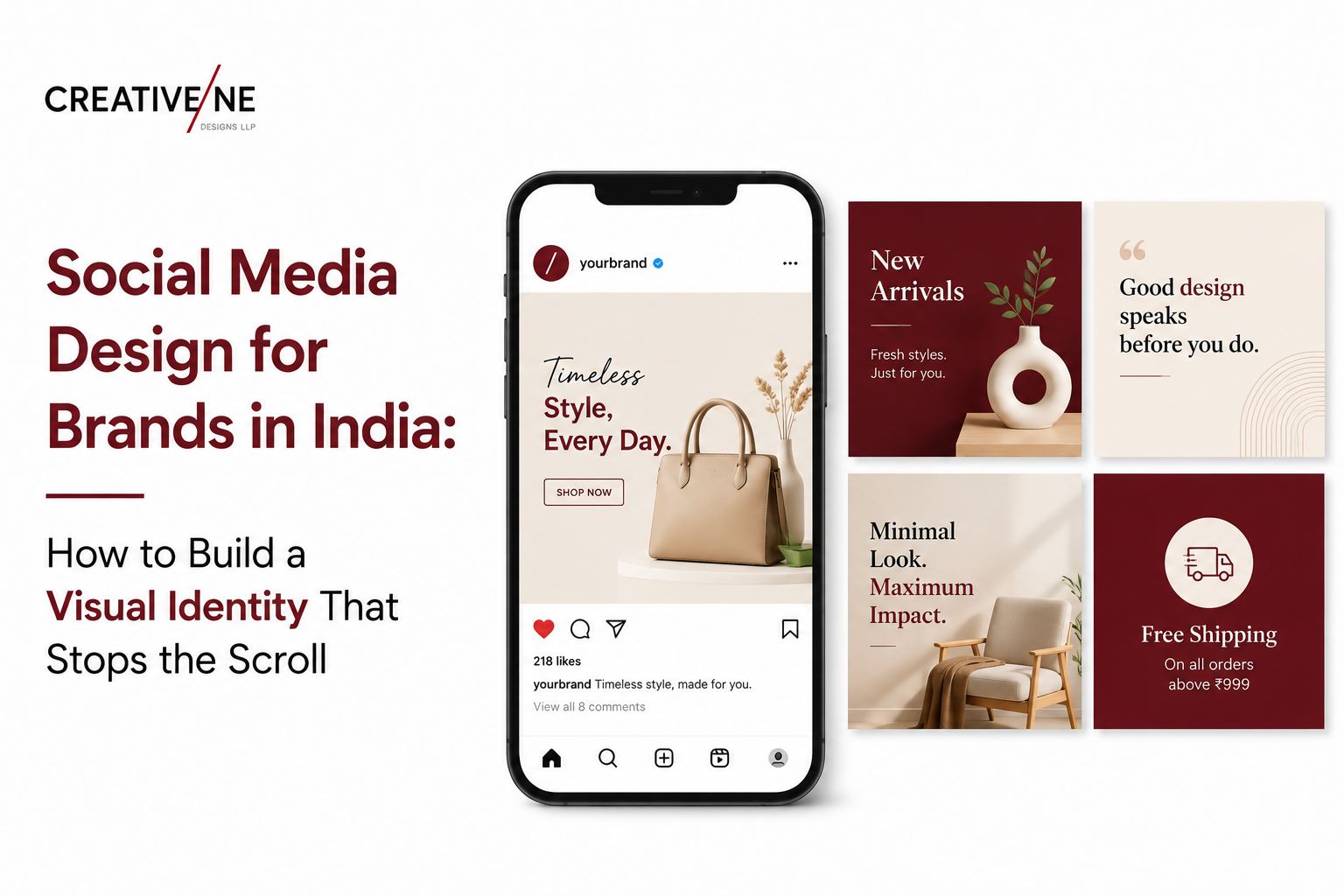
There are 448 million active social media users in India. A post from your brand has approximately 1.7 seconds to earn attention before the thumb moves on. In those 1.7 seconds, the viewer’s brain is not reading the caption or processing the offer – it is making a pattern-recognition decision based entirely on the visual. Brands that invest in consistent social media marketing design – not just content volume – build recognition that compounds with every post published. Those that post without a visual system create impressions that never accumulate into the brand awareness that reduces customer acquisition cost over time.
Why Visual Consistency on Social Media Builds Brand Value
The most underestimated principle in social media is that consistency of visual appearance compounds over time. A brand publishing 100 posts a year with consistent colours, typography, and visual style creates 100 opportunities for its audience to pattern-match that visual with the brand name. A brand designing every post differently creates 100 disconnected impressions that do not build towards recognition.
India’s most successful D2C brands understand this operationally. Mamaearth communicates ‘natural, safe, modern Indian parenting’ through consistent use of soft greens, warm whites, and natural photography – before a viewer reads a caption. The Moms Co. communicates ‘clean, international quality, premium safety’ through a white-dominant palette and minimal graphic elements. The visual design is doing as much brand work as the product or the influencer partnerships.
The Elements of a Social Media Visual Identity System
Brand Colours – Active Use, Not a Reference Palette
Primary brand colours should appear in every post – as backgrounds, graphic elements, text highlights, or frame borders. Secondary colours support the primary and add variety within the system. Using colours outside the brand palette should be a deliberate decision for specific campaigns, not a default when design ideas run out.
Typography – Hierarchy and Legibility at Mobile Scale
Social media posts are consumed almost exclusively on 4.5 to 6.5 inch mobile screens. Typography that looks elegant on a desktop design preview may become illegible on a phone screen. Brand typography should appear in headlines – where it needs to be recognised and remembered. Clean, high-contrast type at minimum 14 to 16 point equivalent handles body information without visual conflict.
Photography Style – Consistent Direction, Not Random Stock
A consistent photography style means defining: subject placement conventions (centred, offset left, overhead), background preferences (white, natural textures, lifestyle environments), colour temperature (warm, cool, neutral), and level of visual complexity (minimal and clean versus rich and contextual). Stock photography used without style direction produces a mismatched visual archive regardless of how individually well-chosen each image is.
A Template System – The Framework That Enables Volume
A social media visual identity is operationally useless without a template framework that enables content production at volume without starting from scratch each time. Templates cover: product showcase post, offer and promotion card, testimonial or review card, educational carousel, story format, and cover image – each designed within the same visual system with variable content slots.
Social Media Post Design by Platform
Instagram – Grid, Carousel, and Story Dimensions
Feed posts: 1080×1080 pixels (square) or 1080×1350 pixels (portrait, recommended). Stories and Reels: 1080×1920 pixels with a 250-pixel safe zone at top and bottom to avoid interface overlap. Carousel posts should be designed as a visual narrative – the first card stops the scroll, subsequent cards deliver value, and the final card includes a clear CTA. The grid aesthetic – how 9 to 12 posts look together on the profile – should be planned as part of the visual identity system.
Facebook – Feed Posts and Cover Images
Feed images: 1200×630 pixels for link posts, 1080×1080 for organic posts. Page cover images: 820×312 pixels. Facebook posts with text embedded in images perform poorly in organic reach due to algorithm preferences – keep text in the caption rather than in the image, except for designed information posts where text-on-image is expected.
LinkedIn – Professional Tone and Document Posts
Document posts (PDF carousels) consistently achieve the highest organic reach on LinkedIn – a well-designed infographic deck can reach 5 to 20 times the audience of a standard image post from the same account. LinkedIn design should emphasise information density, professional typography, and data visualisation over lifestyle photography.
Aligning Visual Design with Content Planning
A visual identity system delivers value only when aligned with a planned social media content strategy that defines which messages, formats, and themes are published before the design brief is written. The design system answers what each post type will look like; the content strategy answers how often each type will be published and what it needs to communicate.
Common Social Media Design Mistakes Indian Brands Make
- Treating each post as an independent design project – no visual system in place across the archive
- Text-heavy posts that require reading to understand – visuals should communicate, not illustrate text
- Generic stock photography with no brand-specific direction or consistent style
- Designing for desktop preview without testing at 375-pixel mobile width
- No template framework – every post designed from scratch produces inconsistency and slow content velocity
- Story designs placing critical information in the top or bottom 250 pixels where interface elements cover it
For smaller Indian brands managing social media in-house with limited resources, the strategic context covered in marketing for small businesses provides the framework within which a consistent visual design system creates maximum impact – matching post type and frequency to the platform’s algorithm behaviour and the brand’s available design capacity.
Building a Template System That Scales
Data from Hootsuite’s social media benchmarks consistently shows that visual content – image carousels, infographic posts, and short-form video with branded visual elements – generates 2 to 3 times higher engagement than text-only posts across every platform. A scalable template system covers a minimum of six to eight post types: product showcase, promotional offer, testimonial, educational carousel slide, founder story, seasonal or event post, behind-the-scenes, and engagement question. Each template shares the same brand colours, typography scale, and graphic elements – while serving a different content function.
Build a Social Media Visual Identity That Grows Your Brand – with Creativeline
Creativeline designs social media visual systems for Indian brands – monthly content design packages, Instagram grid systems, carousel templates, and story creatives that maintain brand consistency at volume.
FAQs
Q1. How much does social media design cost in India?
A: Monthly packages range from Rs. 5,000 to Rs. 15,000 for 8 to 12 post designs, to Rs. 20,000 to Rs. 50,000 for a comprehensive service including carousels, stories, reels thumbnails, and ad creatives. One-time template system design projects typically cost Rs. 15,000 to Rs. 40,000.
Q2. What is a social media visual identity and why does it matter?
A: A social media visual identity is the design system that makes a brand recognisable across all posts – defined colour palette, typography, photography style, graphic element library, and post templates. It matters because visual recognition compounds over time: consistent posts train the audience to associate the visual with the brand name, building recall that reduces acquisition cost.
Q3. How many posts per week should a brand publish on Instagram in India?
A: The recommended minimum for brand-building is 4 to 5 feed posts per week plus 5 to 7 stories. Consistency over months matters more than peak frequency – posting 5 times per week for 6 months outperforms posting 10 times per week for 2 months.
Q4. What are the correct image dimensions for Instagram posts and stories in 2025?
A: Feed posts: 1080×1080 (square) or 1080×1350 pixels (portrait). Stories and Reels: 1080×1920 with 250-pixel safe zones top and bottom. Carousel slides match feed post dimensions. Profile picture: 320×320 pixels displayed as a circle.
Q5. Should a brand use the same visual design for Instagram and LinkedIn?
A: Core brand elements – colours, typography, logo – should be consistent. Post density and tone should differ. Instagram favours visual-forward posts with minimal text. LinkedIn favours information-rich posts and document carousels. Templates should be adapted per platform, not mechanically reposted.
Q6. How do I create a consistent visual theme for my brand’s Instagram account?
A: Define four to five fixed visual parameters: primary background colour or texture, dominant colour palette, typography style, photography mood, and one recurring graphic element. Apply these to every post template. Audit the grid monthly – any post breaking the visual system should be redesigned before publishing.
Q7. What is the difference between social media design and social media marketing?
A: Social media design is the creation of visual content – post graphics, carousels, stories, templates, and ad creatives. Social media marketing is the strategy, platform management, community engagement, paid campaign management, and performance analysis. Effective social media requires both – strong design without strategic distribution generates reach without results.
